Alt-F4 #17 - Interface Design Philosophy 11-12-2020
For this week’s issue of Alt-F4, Therenas takes a page out of the FFF playbook and talks about the development process of the next big update for his mod Factory Planner, going into his somewhat philosophical thoughts on interface design. Dr_Doof also shares a cosy little Christmas event with us, organised by the Red Circuit crew.
Interface Design Considerations Therenas
I’ve been working on a big redesign of the Factory Planner mod over the past few months and I thought it would be interesting to share some of the design considerations that went into it. I’ll focus on the most interesting parts of the main interface as that’s the most complex part of the redesign and needed the most thought and planning put into it.
If you’re not familiar with the mod, that’s no problem. I’ll talk about my approach to design in general, which should apply to other situations; the mod will just be the lens through which I focus these thoughts. You also don’t need to be a designer to follow this (I’m not); good design should be obvious to anyone when they see it.
Overview
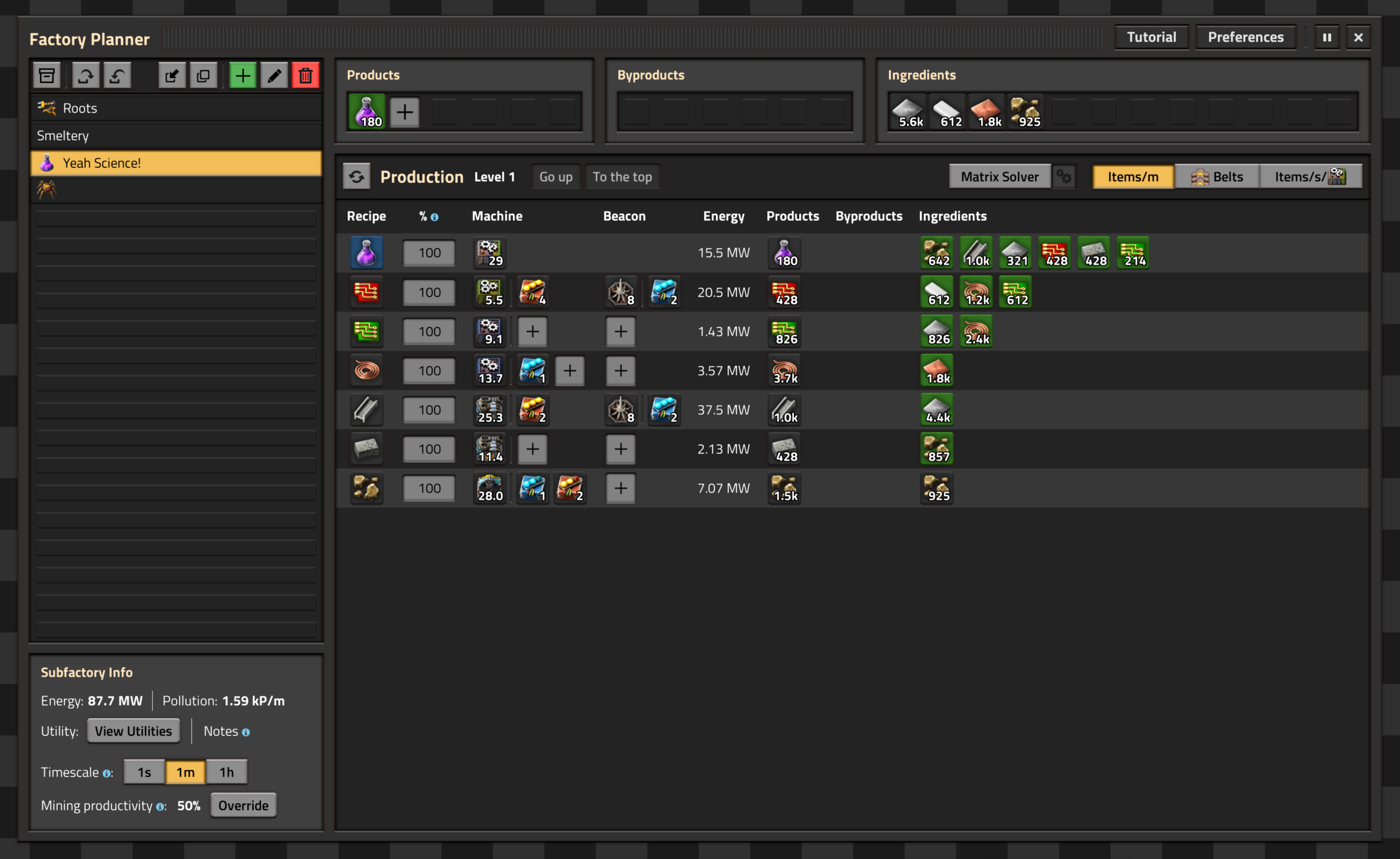
So, let’s have a look at it then, shall we? The left-hand side of these comparisons shows the current version, while the right-hand side is the new and fancy version. First, I’ll give you a bit of an overview so you can get a feel for the mod.
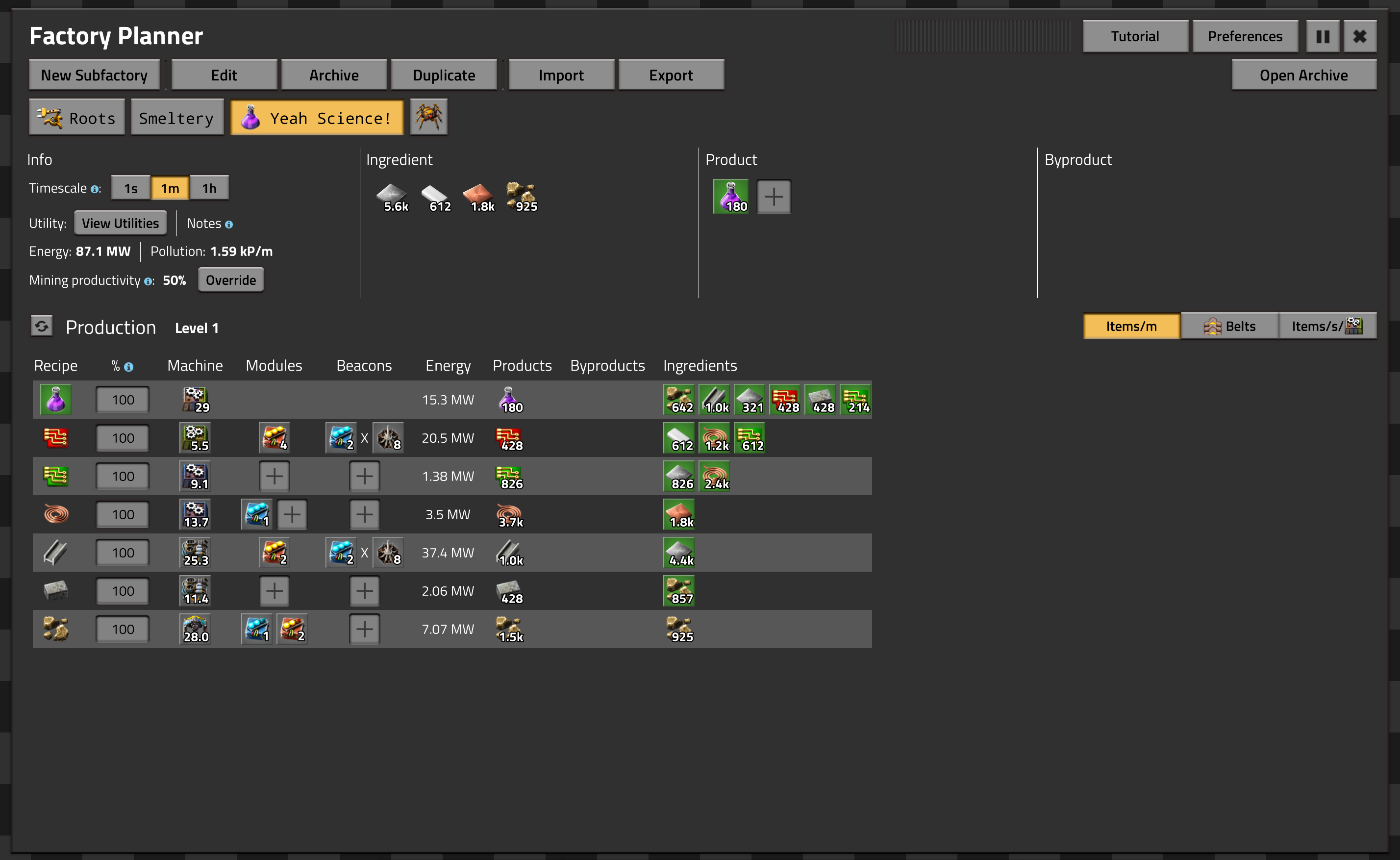
Now why does the old version look so bland? The main reason is that its design dates from the time of Factorio 0.16, which is notably from before the interface design revolution of 0.17. This means it was designed at a time when Factorio UIs looked quite different, and the toolbox offered to modders was far more limited than it is today. Nevertheless, I made do with what I had, and in my opinion the interface came out pretty well from a useability perspective, even if it wasn’t much of a treat visually.
The eagle-eyed among you might have noticed that the first released version of the mod was for Factorio 0.17, not 0.16. What’s my excuse then for not just updating to the new visual standard before release? Well, I needed to prioritise what I wanted to spend my time on and adding support for missing must-have features (such as modules and beacons) was more important than updating the interface.
This basic logic remained true for a long time; there was always something else that needed improving first. Everything is a trade-off (especially in design, as we’ll see very soon!), and only a few months ago did this redesign become worth it to me. A complicating factor is that the task was a lot of work, needing a complete rethinking of the interface and a rewrite of thousands of lines of complicated code. Not something you’d bang out on a Sunday afternoon, that’s for sure.
Before we get into the nitty-gritty, I want to discuss some terminology. The word design has several different meanings depending on context. In this piece, I do not want to go over the design in terms of how it looks visually; I pretty much ape what Wube uses for its own interfaces, only deviating in some minor ways. This is much more economical as I can reuse a lot of their hard work, and it also just makes sense to make it feel similar to the base game so it fits in properly. The design I do want to get into concerns itself more with the layout and interaction considerations that come up.
Action Buttons
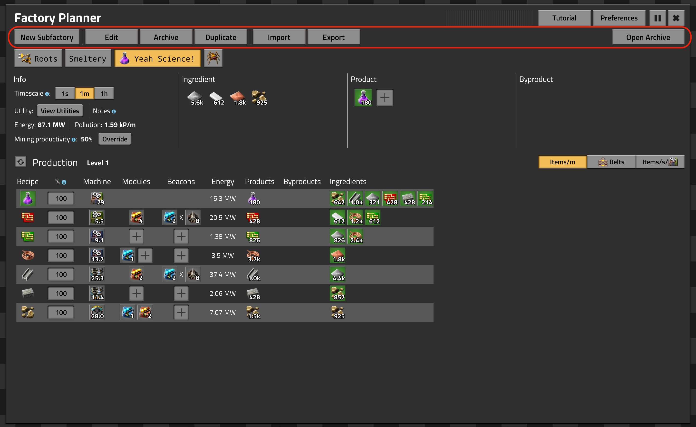
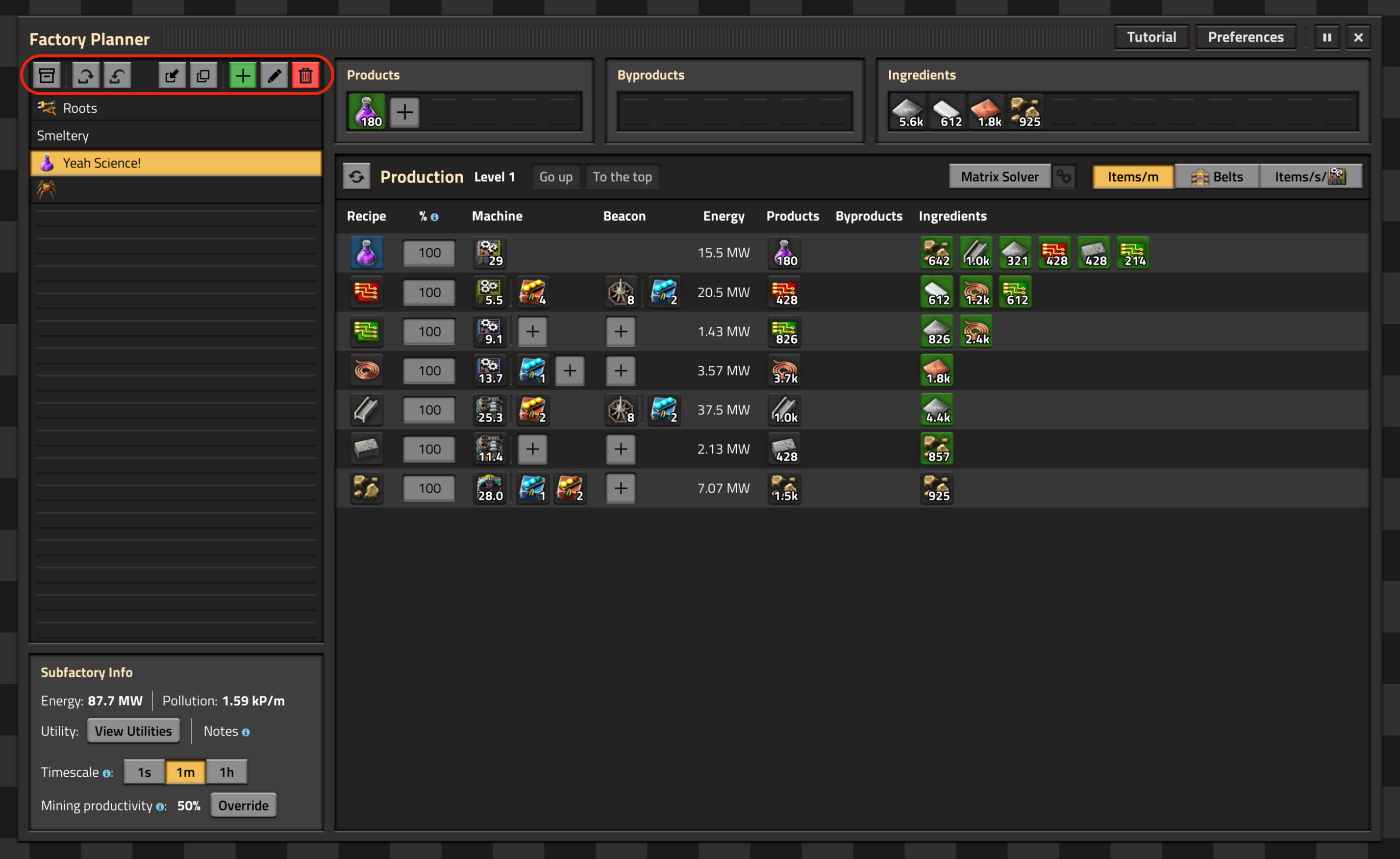
The buttons indicated in red allow you to perform various actions on the currently selected subfactory, which is the one whose button is coloured yellow. One problem with the old design is that these buttons take up quite a bit of space, wasting the empty space in the middle. Changing them from text- to icon-buttons significantly reduces their size and allows them to be moved above the (also transformed) list of subfactories, freeing a large amount of space which allows the rest of the elements to move up, making more room for recipe rows.
So far, so good. The icon-based buttons also look prettier in my opinion as they fit into the Factorio aesthetic far better. In addition, having all of them next to each other above the list of subfactories makes it clear what part of the interface they relate to. Nice. Nevertheless, there are some useability challenges (trade-offs) introduced by this change, which is why I kept the old design for so long.
The more obvious one is that icons are almost never as intuitive as text labels; there’s always room for interpretation with icons. Now, users that are new to the mod first have to explore the buttons, hovering over and reading the tooltips to make sure they know what the buttons do. You could jump in and get going much quicker with the old design. The colouring of the ‘add’ and ‘delete’ buttons helps a bit though, mirroring what the vanilla interfaces do.
The less obvious one is very interesting to me. There’s one action button that stands out with the old design. It’s the first one, which explicitly says ‘New Subfactory’, whereas the others merely imply that their action relates to a subfactory. Not a big deal, you might think, or maybe an oversight when designing the interface; it would be more logical, and more consistent, to omit it from every button. Including it has a subconscious effect on the user though: they internalise that what they are putting together is called a subfactory. Nowhere else in the main interface is it called that, yet everyone using the mod knows what a subfactory is, because the button implies it. This allows me to freely use the terminology elsewhere in tooltips and descriptions without having to explain what it is every time, which is very powerful. Building this kind of shared language is important in my opinion, both when using the interface and for communication between developer and users about bugs and features.
This example in particular illustrates the trade-off nature of design quite well, I think. If I can talk about how the old interface is better for two paragraphs, why would I want to change it? Well, it’s a trade-off. I used my judgement to decide that despite the things that get worse, the end result is better in aggregate. It’s also important to note that you can’t view these changes in isolation. Making this part a slight bit worse is a good trade-off if it allows another part, like the subfactory buttons (see below), to be much better.
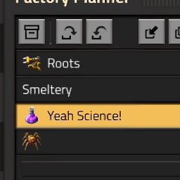
Subfactory Buttons


The subfactory buttons. Oh, the subfactory buttons. These allow you to select the different subfactories you have defined. They caused many headaches over the past two years, and I’m very glad to finally get rid of them. They have been visually unchanged since the beginning, and although their implementation changed a couple times, they’ve always been a giant pile of hacks. Even though this is not entirely design related I need to share my pain a bit, and I think it’s interesting to get a look behind the curtain of how a hack comes to be.
You might notice that the old buttons used a monospaced font. They are the only buttons in the whole interface to do so, and it wasn’t a design decision on my part, but rather something born out of necessity. You see, the way I integrated them into the interface posed problems that needed some rather creative workarounds.
The most significant is that I needed to know when to start a new line of buttons because the first one was filled up. Factorio doesn’t offer any way to do that automatically. To that end, I needed to know how wide every button was. This was not trivial, as their length depended on the subfactory name chosen by the user. The game won’t tell me, so I needed to calculate the width of the text on those buttons.
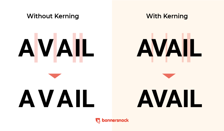
My first, naive attempt used a variable-width font. I foolishly determined the pixel width of every individual letter that could be used in that font. Then, I dynamically added up the width of all the actual letters for every button. If I had known about kerning at that time, I would have known not to attempt this in the first place. Check out the Wikipedia article for more detail but, essentially, the distances between letters in a word are adjusted dynamically so the text looks ‘right’ to us, as you can see here. This means that it’s totally impractical to predict the width of buttons using variable-width fonts; out the window goes that idea.
Determined to work this out I switched to using monospaced fonts, which don’t have this kerning problem; every letter takes up the same amount of space every time, guaranteed. That’s what I needed, and after a lot of fiddling it allowed me to calculate the width of the buttons accurately, making my very convoluted list of subfactory buttons possible. In retrospect, I should have looked for an alternative design instead of diving into this mess. The lesson here is that, sometimes, it’s worth forgoing a certain design if the implementation proves too complicated and/or stupid.
The design considerations for the redesigned subfactory list were quite simple: I needed to save some space. The old buttons took up a lot of it, especially if you have enough subfactories to fill out a second row. Transforming them into a vertical list solves all of the above technical problems in one fell swoop while also just being a more natural layout. The GUI element they are in is called a listbox, after all.
At this point, I want to go into why more vertical space was a central aim in this redesign. I mentioned it before, and there are quite a few arguments for it. For one, the recipe rows are the main content you want to see and interact with, so it makes sense to get as many of them on screen at once as possible. All the other parts of the interface, and especially the list of subfactories, are secondary.
Another reason to reoreint the subfactory list has to do with optimising for screen ratios. Modern screens are 16:9 or even wider, meaning they are wider than they are tall and making vertical space at a higher premium than horizontal space. If you can arrange things to use more horizontal space than vertical space that’s likely a more efficient use of your canvas. This is especially effective in this case as recipe rows don’t actually need the whole width of the dialog, wasting some horizontal space in most cases anyway. Thus, we can gain vertical space without losing anything by giving up some of the spare horizontal real estate, which is obviously a favourable trade-off.
Item Boxes
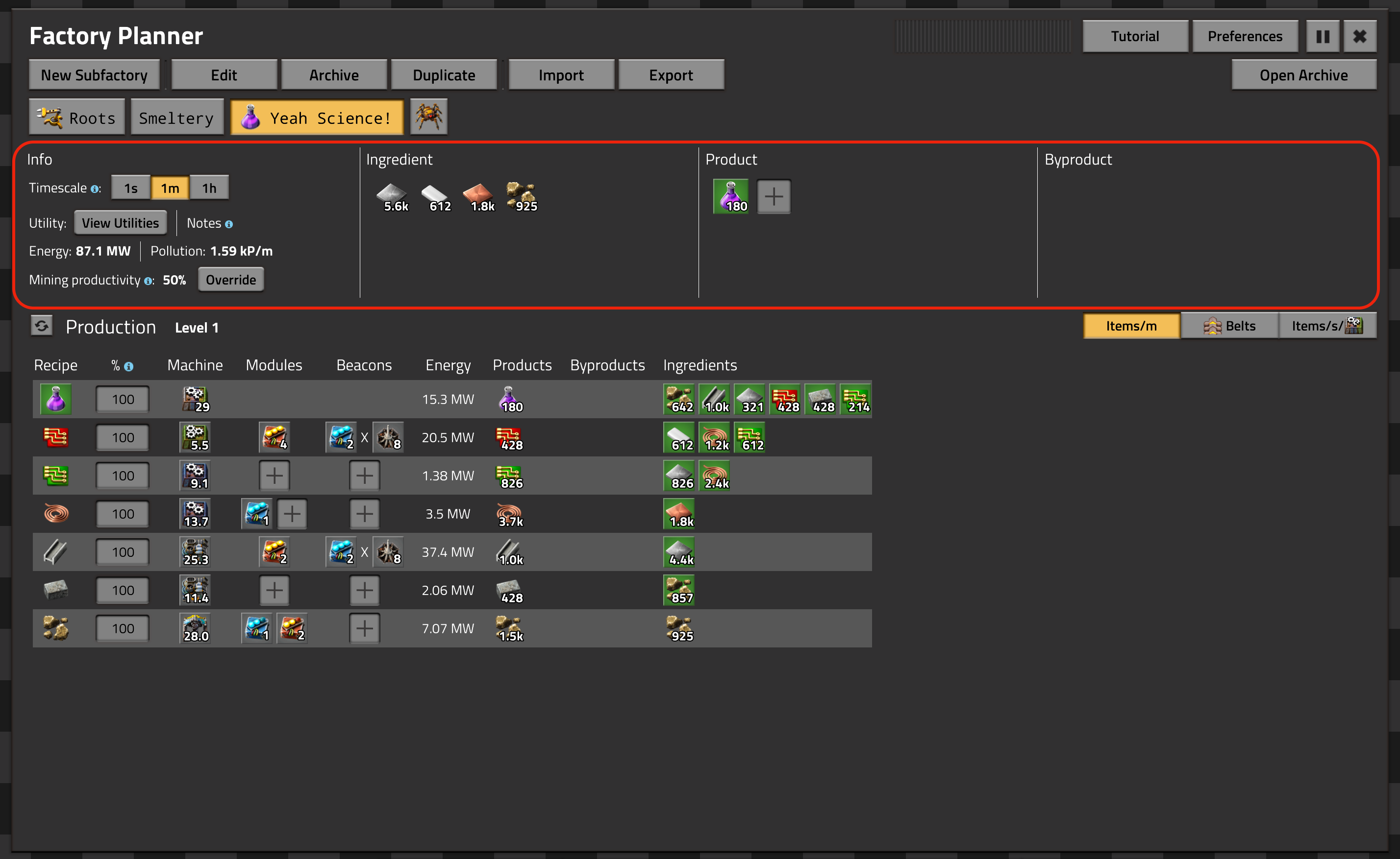
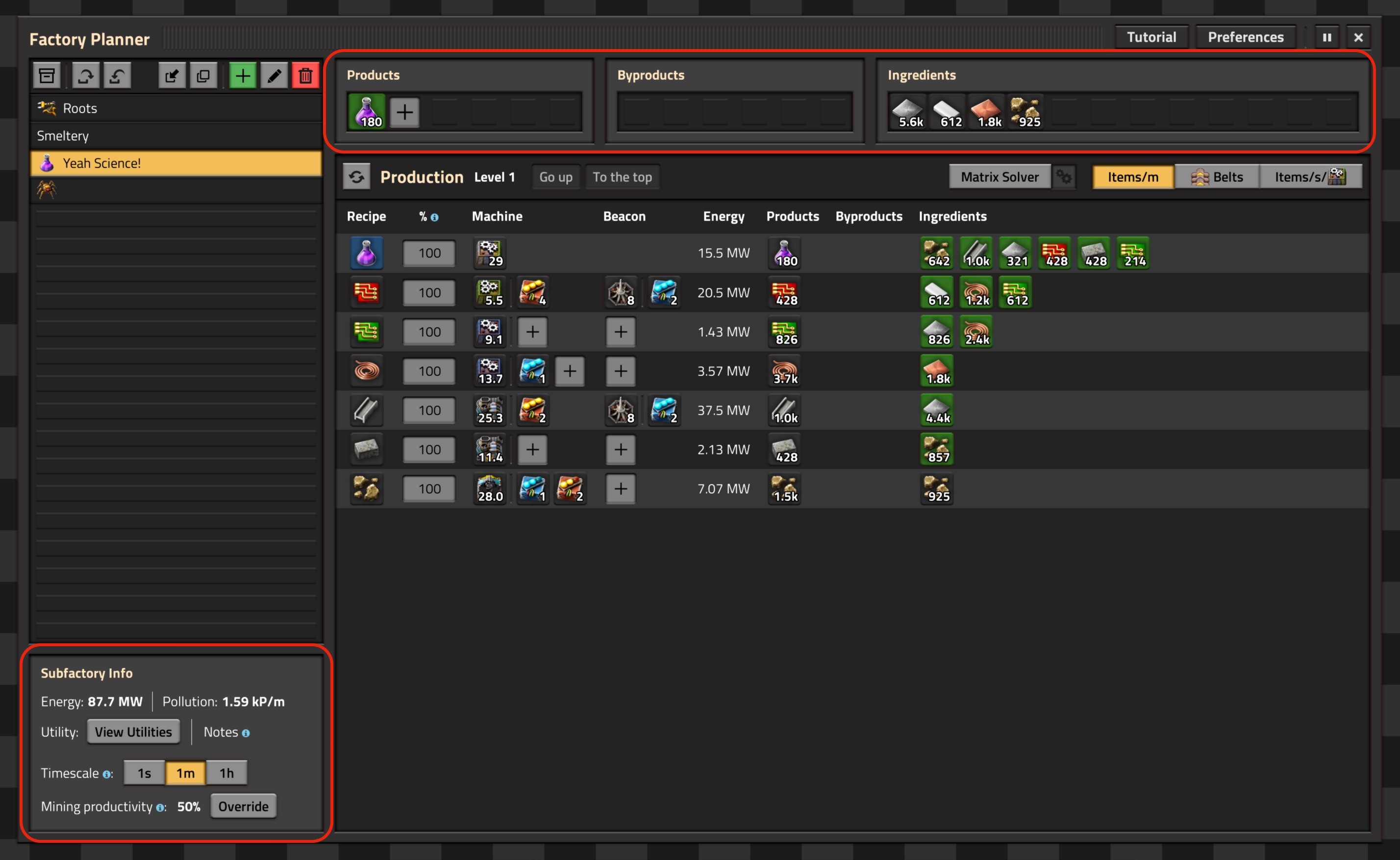
Lastly, let’s take a look at the item boxes, which include the info pane on the left in the old design. They give an overview of the net input/output of your subfactory, with the info pane containing some auxiliary information and functionality. The old solution was pretty elegant but turned out to be very inflexible. Here again, it takes up a lot of vertical space which, as you know by now, is at premium.
The first point of contention in regard to flexibility is the fixed height of all four sections; they had to be the same size due to the way the layout is set up. As we see in the screenshot, the boxes containing items are nowhere near filled up, wasting lots of space just because the info pane has certain dimensions. In the new design, the interface is free to scale down those boxes if there’s no need for them to be larger. This frees up (you guessed it) vertical real estate, which we love. I also made the widths of the individual boxes variable, allowing the ingredients box to be twice as large as its siblings if it contains more items, which makes sense as you’ll usually have more ingredients than products or byproducts.
The other point regarding flexibility is the content of the info pane. In the old design, its size directly determined how big the item boxes were, and in turn how much vertical space they occupied. This meant that adding anything to it wasted a whole row of content. I settled on four info pane rows because that’s all I could afford. The new design allows me to use as many rows for the info pane as I want, since reducing the height of the subfactory list is not that big of a deal.
Conclusion
As you’ve probably noticed by now, the most important goals for this redesign were increased flexibility and vertical space. I made several changes to accomplish this, often with significant trade-offs that needed to be carefully balanced. Sometimes though, you’ll hit upon that perfect change that just works out in all aspects, which feels great. I hope you enjoyed this look at the considerations you need to make when designing an interface.
You can check out Factory Planner on the mod portal (the update containing these changes will be out later today), and join my Discord if you want to have a chat. I’m always happy to talk about these kinds of things. Also, huge shoutout to Raiguard who is a bit of a trailblazer for post-0.17 visual design. He helped me get comfortable with the new design elements and gracefully nitpicked my first attempts, which was genuinely very helpful. This was his initial idea of what the redesigned interface might look like, which I morphed into the current design. Why I made the changes I made is another topic altogether though.
Santa Factory - Red Circuit Event Dr_Doof
Red Circuit is committed to creating presents for Santa! They invite you to join their Factorio Santa Factory event this Saturday 12th December at 12 noon UTC. It will be modded slightly to help you feel that winter feeling, and science packs are replaced by presents for Santa. We hope to see you there!
Odpočet skončil
’Twas the 12th of December when all through our ship
Not a computer was working, not even a blip.
The Red Circuit team was all snug in Discord
With hopes you join us and bring more aboard!
When from the ship there came a loud crash
All jumped off board for it was all smash
We looked all around to see alien snow
With copper, and coal, and uranium all aglow!
A factory to build in the cold winter land
With your help it could be amazingly grand!
Come join us this day at 12 UTC
And build a factory for the whole world to see!— Dr_Doof
Contributing
As always, we’re looking for people that want to contribute to Alt-F4, be it by submitting an article or by helping with translation. If you have something interesting in mind that you want to share with the community in a polished way, this is the place to do it. If you’re not too sure about it we’ll gladly help by discussing content ideas and structure questions. If that sounds like something that’s up your alley, join the Discord to get started!